📊 Dashboard Overview
- 🎯 Centralized Control: Access all essential monitoring tools in one place
- 📈 Real-time Insights: Monitor productivity and performance as it happens
- 🔄 Adaptive Views: Different perspectives for admins, managers, and users
The Mera Monitor dashboard provides a comprehensive, real-time view of your organization's productivity metrics. This guide breaks down the elements visible on the main dashboard.
Understanding the Dashboard Layout
The dashboard is organized into several key sections:
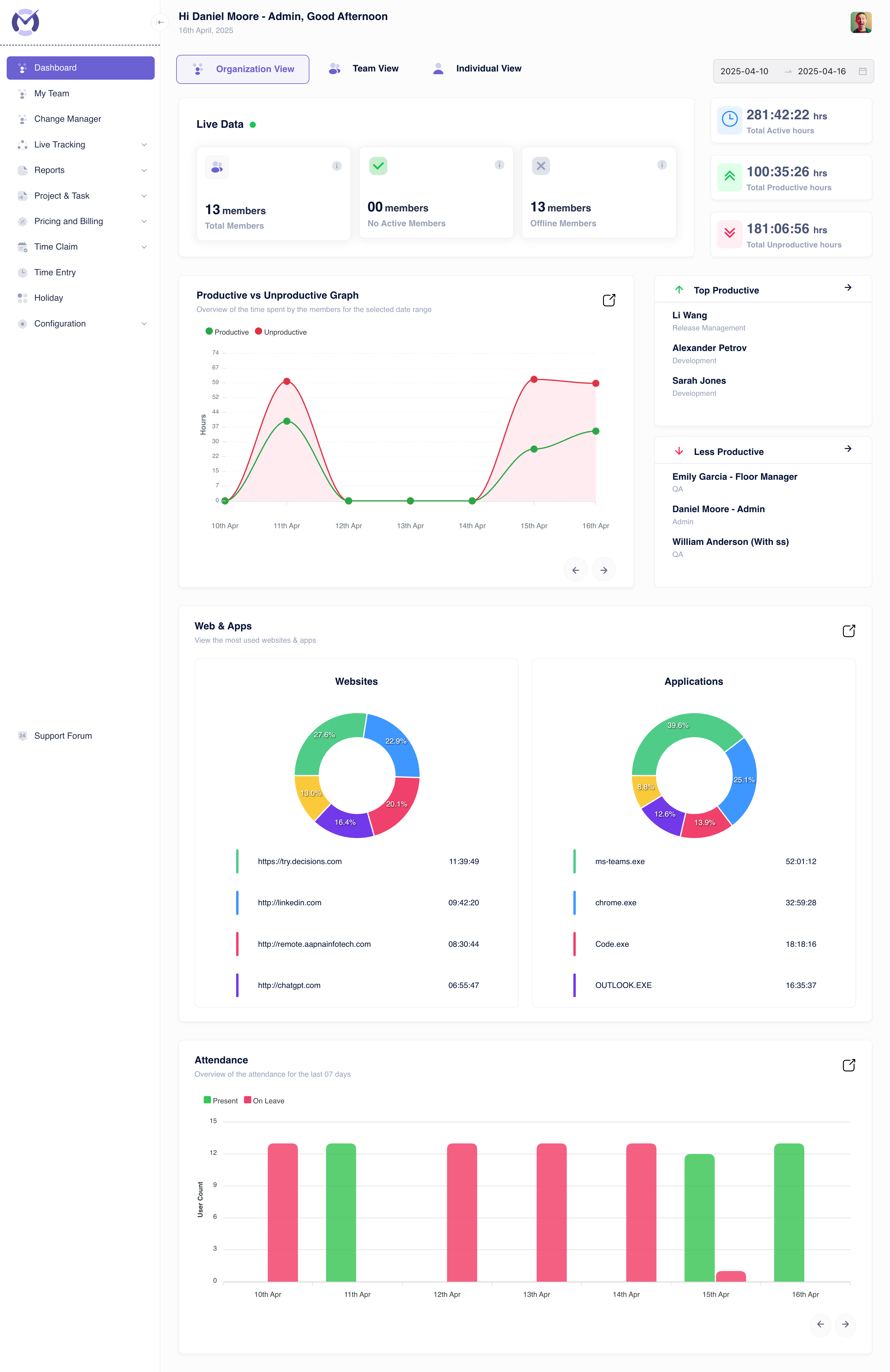
1. Header and Navigation
Located at the very top, this area includes:
- Greeting & Date: Welcomes the logged-in user (e.g., "Hi Daniel Moore - Admin, Good Afternoon") and shows the current date (e.g., "16th April, 2025").
- View Modes: Buttons to switch between Organization View, Team View, and Individual View, allowing data analysis at different levels.
- Date Range Selector: Allows filtering the dashboard data for specific periods (e.g., "2025-04-10 → 2025-04-16").
- Profile Access: Typically includes the user's profile picture or initials, providing access to profile settings and logout options.
2. Sidebar Menu
Positioned on the left, this menu provides access to all major features of Mera Monitor:
- Dashboard: Returns to this main overview page.
- My Team, Change Manager, Live Tracking, Reports, Project & Task, Pricing and Billing, Time Claim, Time Entry, Holiday, Configuration: Links to respective modules for detailed management and analysis.
3. Download Application Banner
Displayed prominently if the desktop agent isn't detected or actively tracking:
- Prompt: Encourages users to "Download application to start tracking your time."
- Download App Button: Provides a direct link to download the necessary desktop agent software.
4. Live Data Overview
This section provides a snapshot of the current workforce status:
13
Total Members
👥Represents the total number of users configured in the system within the current view (Organization/Team).00
Active Members
✓Shows the count of members currently active and being tracked by the desktop agent. (Shows "No Active Members" if zero).13
Offline Members
⭘Indicates the number of members who are currently not active or logged out.5. Productivity Time Metrics
Adjacent to the Live Data, this section summarizes key time-based productivity indicators for the selected date range:
Total Active Hours
281:42:22 hrs
Total duration users were logged in and actively using their computers.Total Productive Hours
100:35:26 hrs
Time spent on applications and websites categorized as productive.Total Unproductive Hours
181:06:56 hrs
Time spent on applications and websites categorized as unproductive.6. Performance Analysis Section
This area provides deeper insights into productivity trends:
- Productive vs Unproductive Graph: Displays a visual comparison (line chart with area fill) of productive (green line) and unproductive (red line) time over the selected period (e.g., 10th Apr - 16th Apr). Shows hours on the Y-axis and dates on the X-axis. Navigation arrows allow scrolling through the date range.
- Top Productive: Lists members with the highest productive activity. Example:
- Li Wang (Release Management)
- Alexander Petrov (Development)
- Sarah Jones (Development)
- Less Productive: Lists members with lower levels of productive activity. Example:
- Emily Garcia - Floor Manager (QA)
- Daniel Moore - Admin
- William Anderson (With ss) (QA)
7. Web & Apps Usage Overview
Provides insights into digital tool usage through donut charts and lists:
Websites
Displays the most frequently visited websites by users, showing percentage and total time. Example:
- https://try.decisions.com: 11:39:49 (27.6%)
- http://linkedin.com: 09:42:20 (13.0%)
- http://remote.aapnainfotech.com: 08:30:44 (20.1%)
- http://chatgpt.com: 06:55:47 (16.4%)
Applications
Shows the most used applications across the team/organization, showing percentage and total time. Example:
- ms-teams.exe: 52:01:12 (39.6%)
- chrome.exe: 32:59:28 (25.1%)
- Code.exe: 18:18:16 (12.6%)
- OUTLOOK.EXE: 16:35:37 (13.9%)
8. Attendance Overview
Visualizes attendance patterns for the last 7 days:
- Chart: A bar chart showing the daily count of users. For the period 10th Apr to 16th Apr, it shows roughly 13 users present each day, with one user marked "On Leave" on 15th Apr.
- Legend: Differentiates between members marked as "Present" (green bars) and those "On Leave" (red bars).